How Birds Eye saved money on printing without sacrificing brand identity

Birds Eye UK&I is a part of Nomad Foods a NYSE listed frozen foods company, headquartered in the United Kingdom.

Birds Eye has continued to maintain a strong and instantly recognisable brand identity for nearly a century. They remain a consistent consumer favourite for families all across the country.

For a brand that has stood the test of time, it was our pleasure to provide Birds Eye with all the technical support at their disposal to ensure they could continue to deliver their well-loved products with a strong brand identity.

A long standing relationship made easy with time and effort

We’ve had the pleasure of having Birds Eye as a client for quite some time, so of course when they asked if we could help them reduce their packaging costs, we were more than happy to oblige.

The cost of printing is just too much to pay

Given Birds Eye are the market leader in frozen food with incredible scale across multiple product categories, it was no surprise when we were approached for ways to reduce their printing costs.

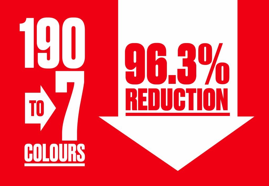
With a little time on our end, the studio team at Pulse put their heads together to come up with some ideas. There was one solution that would fit the bill perfectly; fixed colour palette printing. This would need to be carefully managed from start to finish – so here’s how we did it.

‘we didn’t expect the results to have such a positive impact on the business.’

pound sign in circle with arrow pointing down gmg opencolor logo and box
blue, pink, yellow and black paint splashing together

Creative solutions to overcome limitations

We started by listing all the spot colours Birds Eye currently used across their packaged products. From there, these spot colours were converted into four colour process, and printed using the latest GMG Opencolor software.

We also had to take into account the different print process by limiting the number of process colours used per spot conversion to help reduce possible print registration issues and combat ink saturation.

Placing these next to the original spot colour, reference measurements were then taken to see how close in colour they were once converted.

Now that a central target had been established for each spot colour made from process, our colour management wizards calibrated each printer’s specification back to this target taking into account the print process, substrate and ink. No pressure!

This process was presented to the folks at Birds Eye and very quickly signed off, due in large part to our long standing partnership based on trust.

To ensure the much-loved brand maintains its strict colour control for future designs, Pulse created a process pantone book for Birds Eye to pass on to future design agencies, so they too can work to four colour printing from the get-go at the design stage.

A successful reduction of excess colours without a dip in quality

The number of colours used across their packaging portfolio went from 190 to 7 – a massive 96.3% reduction!

Don’t just take our word for it

“When we asked Pulse to find a print saving solution, we knew it would be a challenge – but we didn’t expect the results to have such a positive impact on the business. There were a lot of stakeholders involved throughout the process ranging from Marketing Directors, Packaging Technologists to Printers. Right at the heart of the project, Pulse managed everyone’s expectations perfectly, explaining clearly what would need to happen for this to be a success. Once the trials had been carried out there were no surprises; everything Pulse had predicted, Birds Eye received. They even assisted in a full fixed colour palette educational rollout, which was key to resetting colour standards, expectations, and helped shift the culture of this process so it could be maintained and future proofed.”

Lionel Carrasco, Senior Packaging Development Manager